How I increased conversion by over 160%
Background
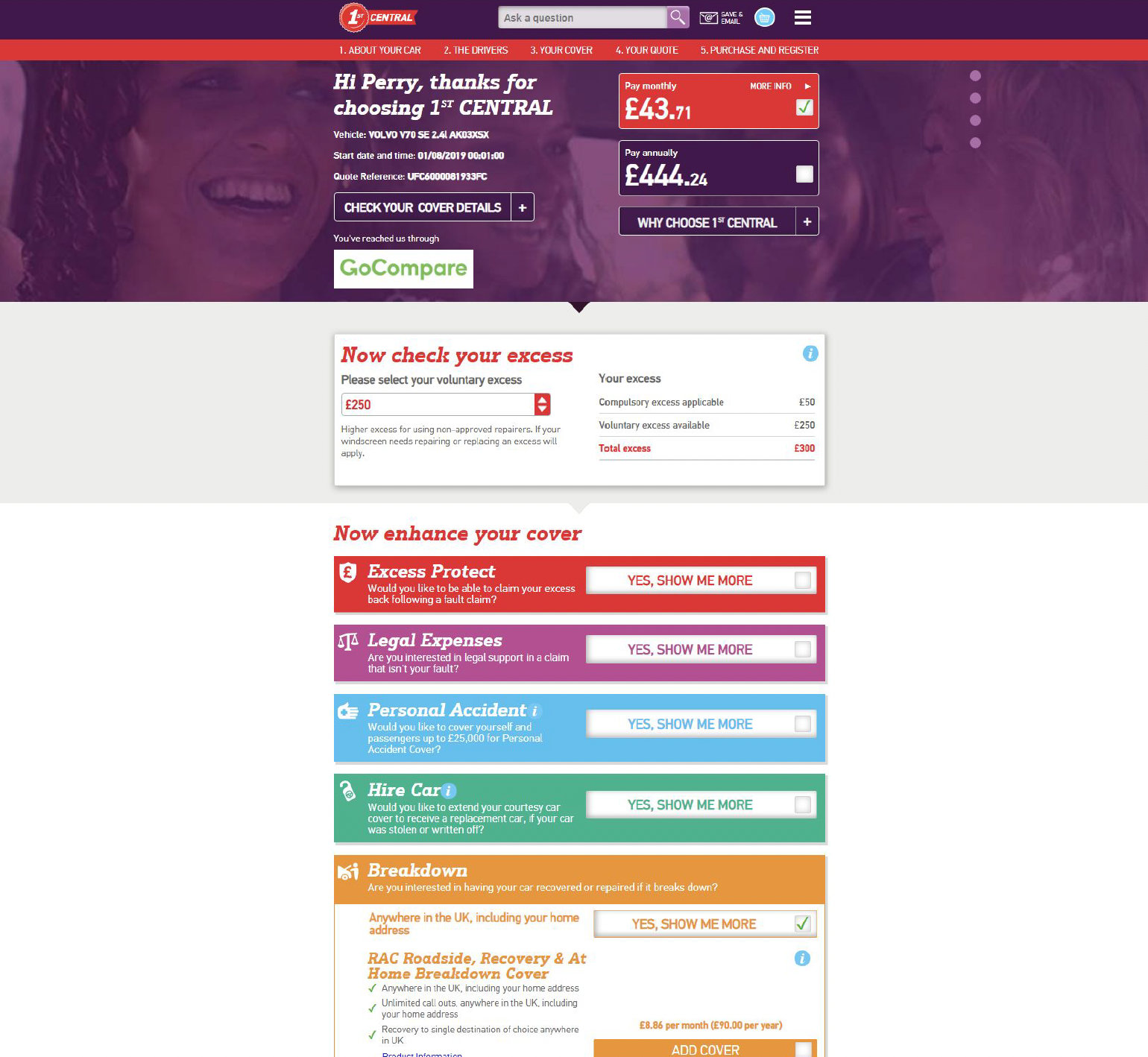
Set of the most important transactional pages for an insurance company. Includes quote summary page with upsell, payment, opening an account and more. Quote summary page gets tens of thousand hits a day.
Problem
– Low conversion rate (around 1%)
– Extremely high bounce rate
– Poor upsell results
– Busy and chaotic design with limited responsiveness

Goal
Solve all of the problems listed above.
Process
Conducted research to understand the nature of the problem and the kind of solutions customers want. I used HotJar session recordings and heatmaps together with GA data to identify pain points.
Worked with the stakeholders and the Legal Team to understand requirements set by The Financial Conduct Authority, that need to be included in the designs.
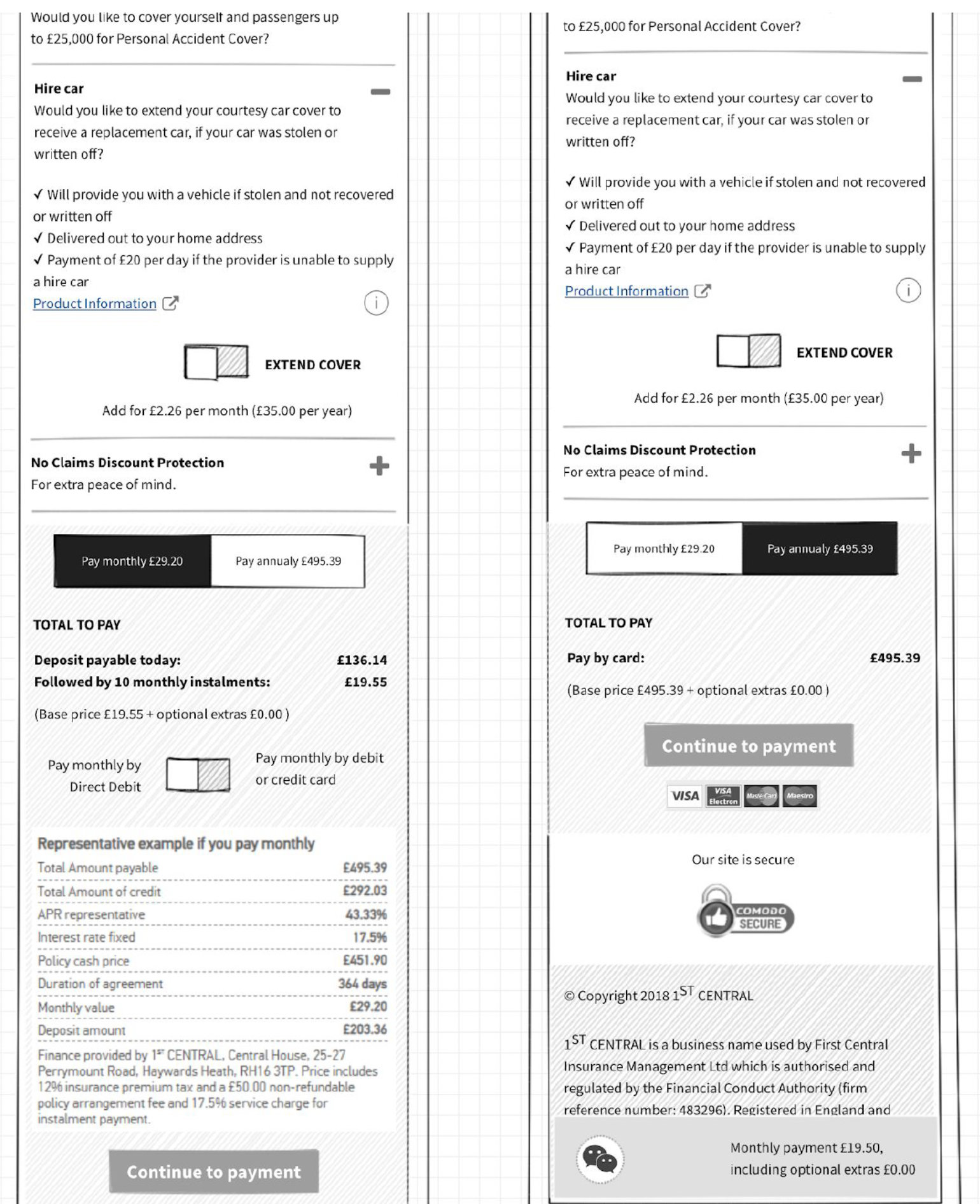
Based on user testing and internal workshops I came up with the first lo-fi wireframes.


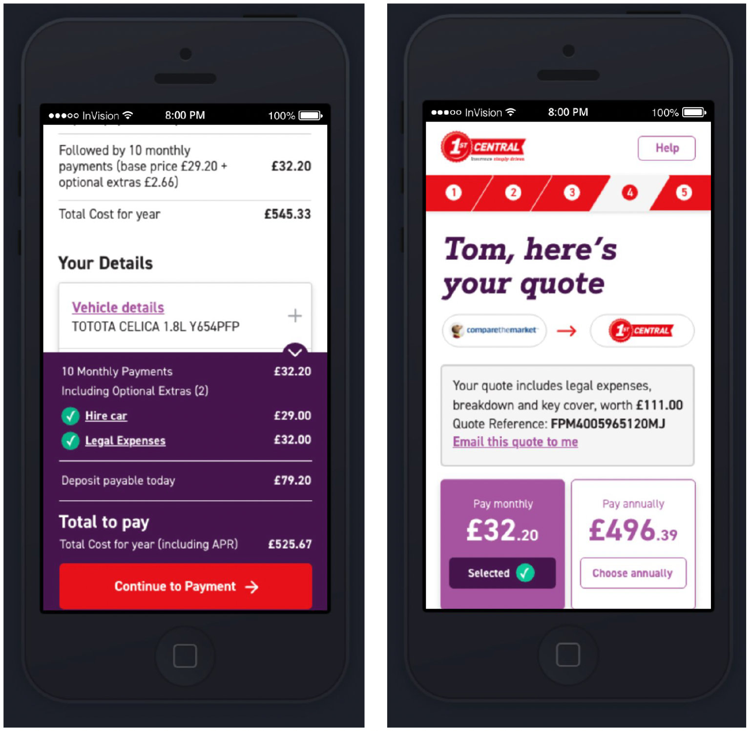
After getting feedback and applying necessary tweaks and changes, I produced a prototype, which was used for face-to-face user testing.


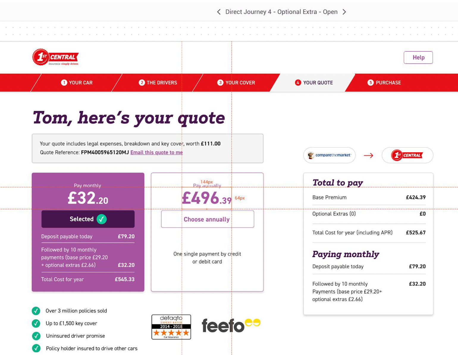
Observations and data gathered during user testing allowed me to present final designs. These where passed to the devs in a "dev-friendly" format.
I was involved in the development process, answering all the questions,


I supported the QA team with the thorough testing.

Results
After a month of successful rollout, conversion went up by over 160%.
Unfortunately I don't have exact data for upsell and bounce rate, but the difference was noticeable.
The new design, new look and feel were an inspiration for further updates to the customer portal and brochureware.